Poster House Museum
- Erin Salthouse

- Oct 5, 2019
- 3 min read
Poster house is a new museum in NYC, and the space was really interesting. Hyper modern angled ceilings and walls against ancient looking columns. The cafe and gift shop and waiting area seemed to flow into each other, separated only by short counters or bookshelves. I came for the Mucha exhibit. I have been a fan of his work since I came across it as a child and I even did a deep dive into the Lorenzaccio poster in college when I recreated it in ceramic.

Things I loved about this exhibition:
It was large scale in posters and in text. You could read quotes from across the room and feel the impact these posters might have had in an outdoor space.


Three images of Sarah Berhardt, a blown up black and white photo on a gallery wall, three tall poster of Berhardt as characters from operas, and a blown up black and white photo of Berhardt on a gallery wall behind a small mucha poster of her in the same pose.
Posters and text were grouped in concise, meaningful ways. There was a timeline on one wall, showing world events in relation to Mucha's work, but I really appreciated the conceptual grouping of the work. How posters are made and the technical skill involved, how Mucha's style was distinctive from other advertisements by centering strong females, how LU cookies used his work, how Sarah Bernhardt worked the system to boost both her and Mucha's celebrity. This organization was very helpful so that I could get a clear idea of the context and significance of the work, as opposed to a dry or overcomplicated survey of his life.


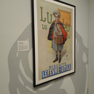


Images of contemporary JOB cigarette advertisement, LuLu biscuits, and a JOB ad in Mucha's style, with elegant woman and spaghetti hair.
There were comparison works from the same time period, which highlighted the context in which Mucha lived and worked bad how his art was so distinctive.
Things I did not like:
The choice for seating was … theatrical. It was unclear if the chairs were on exhibit or for visitors to use.
The second part of the exhibit downstairs felt crowded and started to blur together, with repetitions of the same themes and without large text labels to help orient the visitor. The introductory text went into some detail about how the pressure to create new designs quickly forced Mucha to leave his contract and the country, but this could have benefited from some comparison (for example of the 4 seasons) or perhaps images of his tools and workshop, rather than an uninterrupted spread of his works.

Still, I really enjoyed the experience and was tempted to buy a $200 silk scarf ( I didn't). I wish there had been more low cost items in the gift shop for me to take as a memento, perhaps postcards or enamel pins that match the sticker given to visitors. The main icon was a stylized version of a close up of the Medee face, with a black background. As you can see from his work, a black background is unusual and the pins, bags and posters the museum sold with this did not appeal to me because it didn't feel at all like Mucha's work. There may have been copyright issues and the museum wanted to create an icon that represents the museum, rather than follows the style of Mucha. But I didn't like it.
There is an interactive family space, with sliding multi colored panels of a poster to simulate lithography an interactive magnetic whiteboard with a cityscape one can color on, and a number of activties in the “News” section such as a museum wide scavenger hunt and exhibition-specific guided interactions with the works.

The back of the Mucha card reads, “ Now that you’re in the Gallery
Choose your favorite Mucha poster.
Pose as the main character
Imagine what the main character would say if the poster came to life
Write it here: (lined paper section)
Don’t forget to have your adult photograph you posing with your favorite poster.”
Overall it was a great exhibit for this interesting new space, and I hope the museum encourages accessible programming and reaches out to welcome autistic visitors.
Comments